|
Recent Posts
Subscribe to the Newsletter: The Making of Night Cafe (Part 1)September 28, 2015
I’ve been meaning to put together a post to wrap up the Night Cafe project for some time now. This is the project that won the Platinum award in the Oculus Mobile VR Jam 2015 for apps and experiences as well as the Community Choice award.
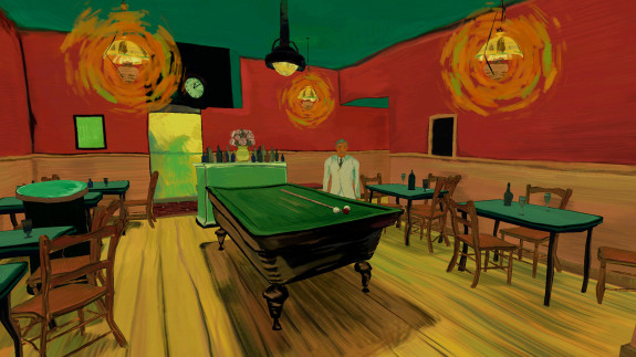
The idea: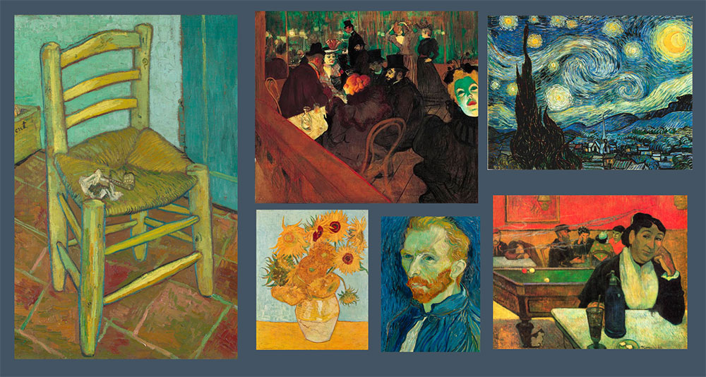 Inspiration was drawn from a variety of painters I was working on a story for a short film that was to be about a fictional painter heavily inspired by Vincent van Gogh. You would enter into his world gradually throughout the film and begin to see the world through his mind’s eye and eventually he would fight a mythical bear in the painted woods. I had plans to build sets and combine it with animation to bring the painterly world to life. At the same time I was beginning to get more into game development and virtual reality and had been teaching myself Unity. Somewhere along the line my 2 interests merged and I realized this type of experience would be perfect for VR. So I suppose it was not so much an “ah ha!” moment as it was a gradual development of an idea. 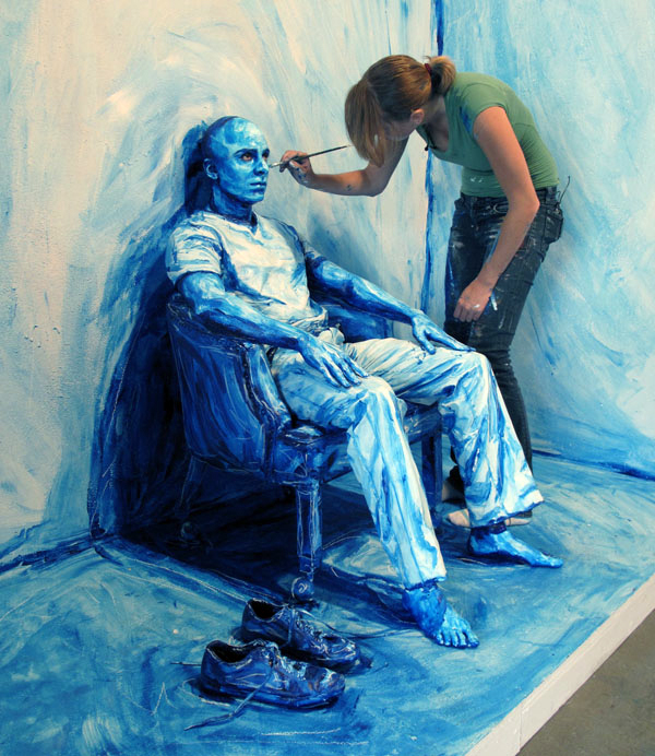 Alexa Meade’s Painted People At the same time I was developing this idea for VR, I had stumbled upon an artist, Alexa Meade, who was doing work that gave me more confidence in the experience I was envisioning. She was applying layers of painted color on top of people and objects and lighting them in ways that she could make photographs that appeared as if they were paintings. It was impressive what she could do without any fancy shaders or post processing, just paint on 3d objects with the right lighting. Pre-Production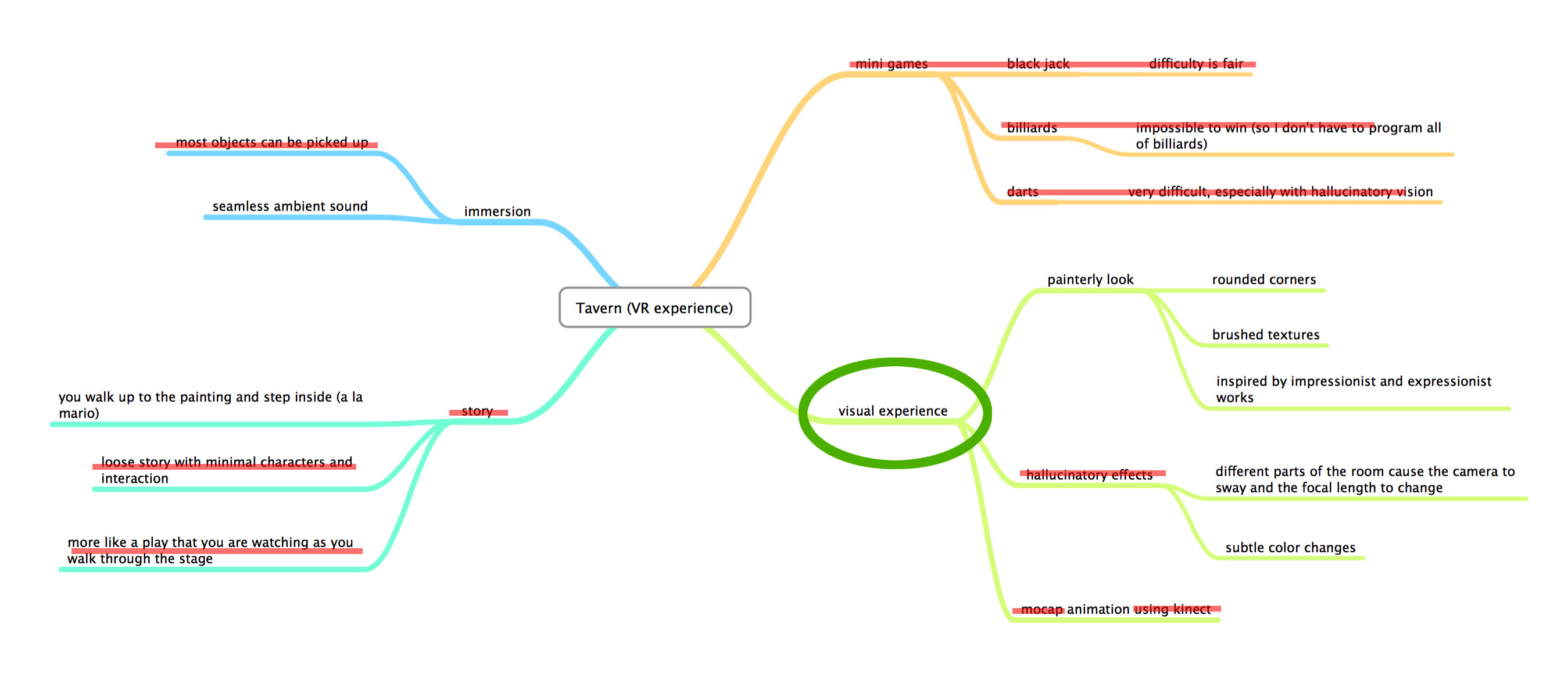 Initial Experience Map The idea was actually much larger at first and was not always planned as a Van Gogh exclusive experience. I wanted to include people and places from many of my favorite paintings (not even all in the same impressionist style!) but Van Gogh was always a focus. In addition to the painterly visuals, I wanted to include many interactive elements such as minigames for the billiard table, perhaps someone playing blackjack at a table and elements of story with café patrons you could talk to. 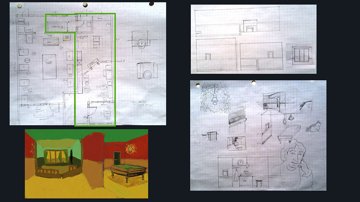 Floor plan (added room shown in green) Early on I had decided Le Café de nuit would be a great painting to use as the base of the experience. The fact that it was an interior meant I could limit the space and therefore limit the overall scope (and therefore actually be able to finish it). I knew I wanted a bigger space than what was shown in the Night Café painting though and so I designed a floor plan that added a separate set of rooms off to the back right of the main space. This separate room also gave me some creative freedom to add my own spin on the environment. 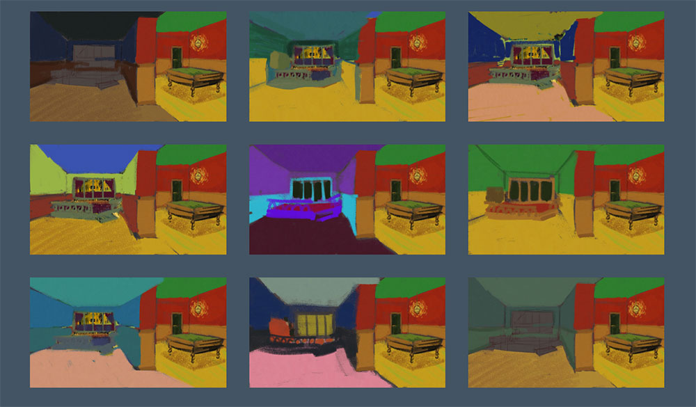 Finding the color scheme took some time This was actually one of the biggest challenges because I had to match the overall tone and feeling from the Van Gogh painting along with finding colors and forms that compliment it — no small task considering Van Gogh is considered “the” master of color by many people. At the very least I would try my best to achieve some level of harmony in the colors. Even though the new space is completely invented, I drew on other Van Gogh paintings as well as other masters to inspire the design. 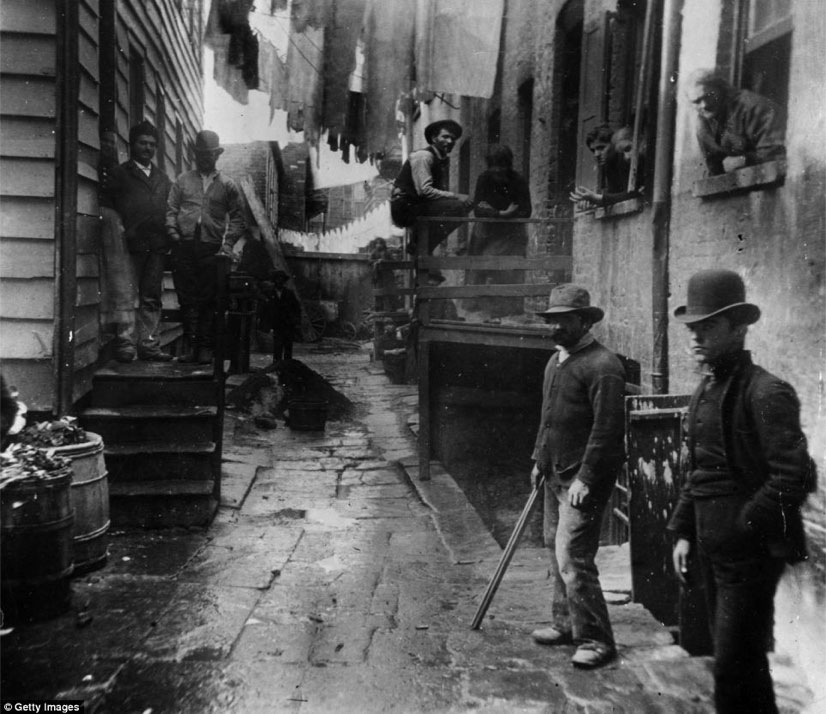 One of my favorite research images, “Bandit’s Roost,” used for back alley inspiration In addition to figuring out the overall floor plan, colors, and scope, there was also a lot of research to be done to make sure I was accurately representing the time period this was supposed to be set which was around the time the painting was made in 1888. I had to figure out things like: what would the outside of the window look like? What type of lamps were those hanging from the ceiling with the radiating paint strokes coming off of them? Some of these things seemed obvious at first but when it came to modeling I had to be sure I was finding the right reference images. In the case of this project, doing the research helped to give the environment some sense of authenticity. TechniqueIt was important to me to be as faithful to the material as I could when I was trying to replicate elements from the paintings. I probably could have saved myself a lot of time by figuring out the shaders and rendering technique I would ultimately use before I started production on building the props and environment. Fortunately, I did experiment with a few styles before I started. I had already ruled out using particles as the brush strokes. Movies such as What Dreams May Come use this technique to great effect making worlds that feel alive. The brush strokes spiral and move in ways you would imagine they would if an impressionist or expressionist painting were to come to life. Disney did some interesting research into painterly rendering techniques but nothing I could really use.  Early tests with particles rendering on surfaces were not satisfactory The problem with particles is they are very heavy on the processor, especially considering I decided to target the Gear VR which is not suited to rendering particles with alpha cutouts. Not only this but I know my strengths are in the art asset creation, not the development of cutting edge particle generation engines that even Disney had a team of engineers working on for *pre-rendered* output (research paper). As a result, I decided the Alexa Meade method was the way to go and I set out to craft the assets. Production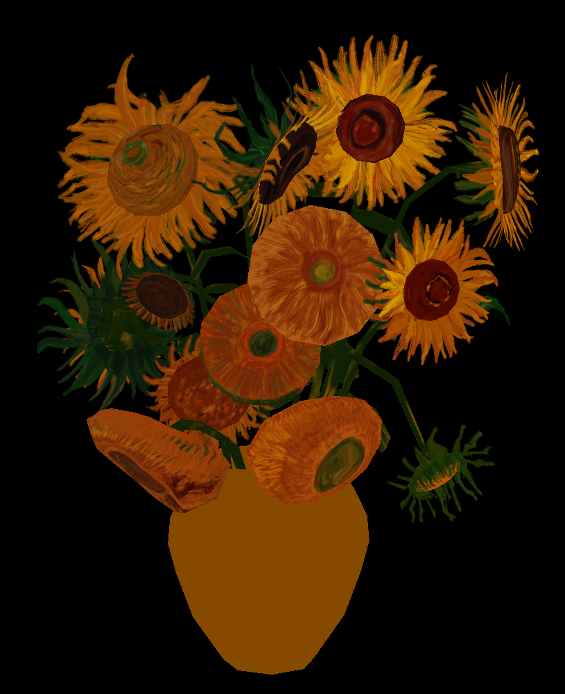 Sunflowers in mid-texture state This is perhaps the most time consuming phase but one I had a lot of fun with. In order to achieve the painterly look, especially one as unique as Van Gogh’s, each asset would have to be carefully digitally hand crafted. Early on I had decided on a set of pillars regarding the visuals:
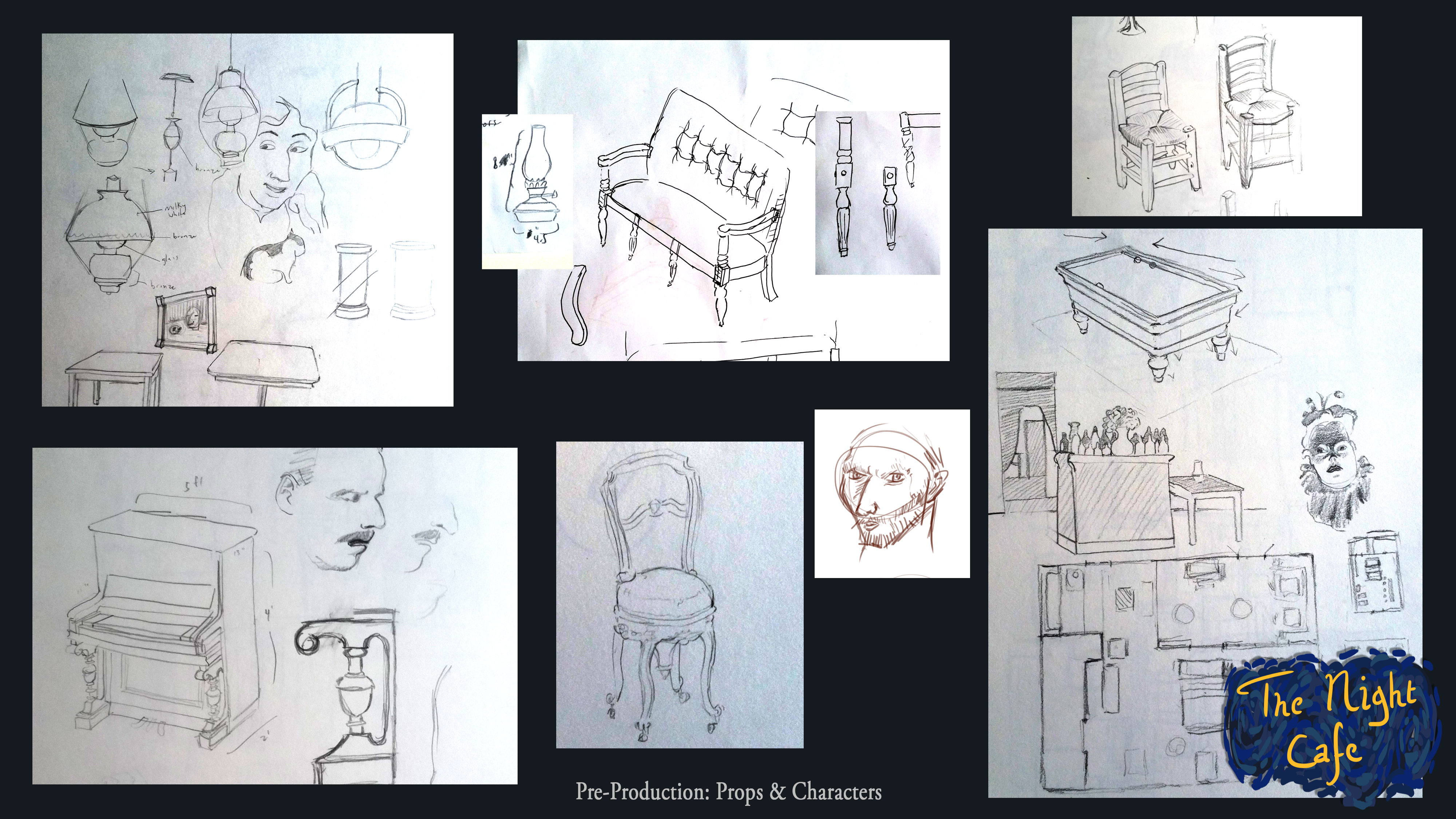 Some sketches from prop modeling Modeling was generally a process of sketching the model on paper first. In order to understand what it is you are trying to make in 3 dimensions you need to imagine it from all sides. This is important because you can’t include a detail in the model if you hadn’t imagined it first and I find sketching on paper (or a Wacom) is the fastest way to figure out the details from all angles. Once the sketch is done I can then go into Maya and build the object using standard modeling techniques. I would often build a very straight and rigid version of the object first, almost like it would appear in reality (i.e. a chair with a straight back and 4 legs all the same shape and size). 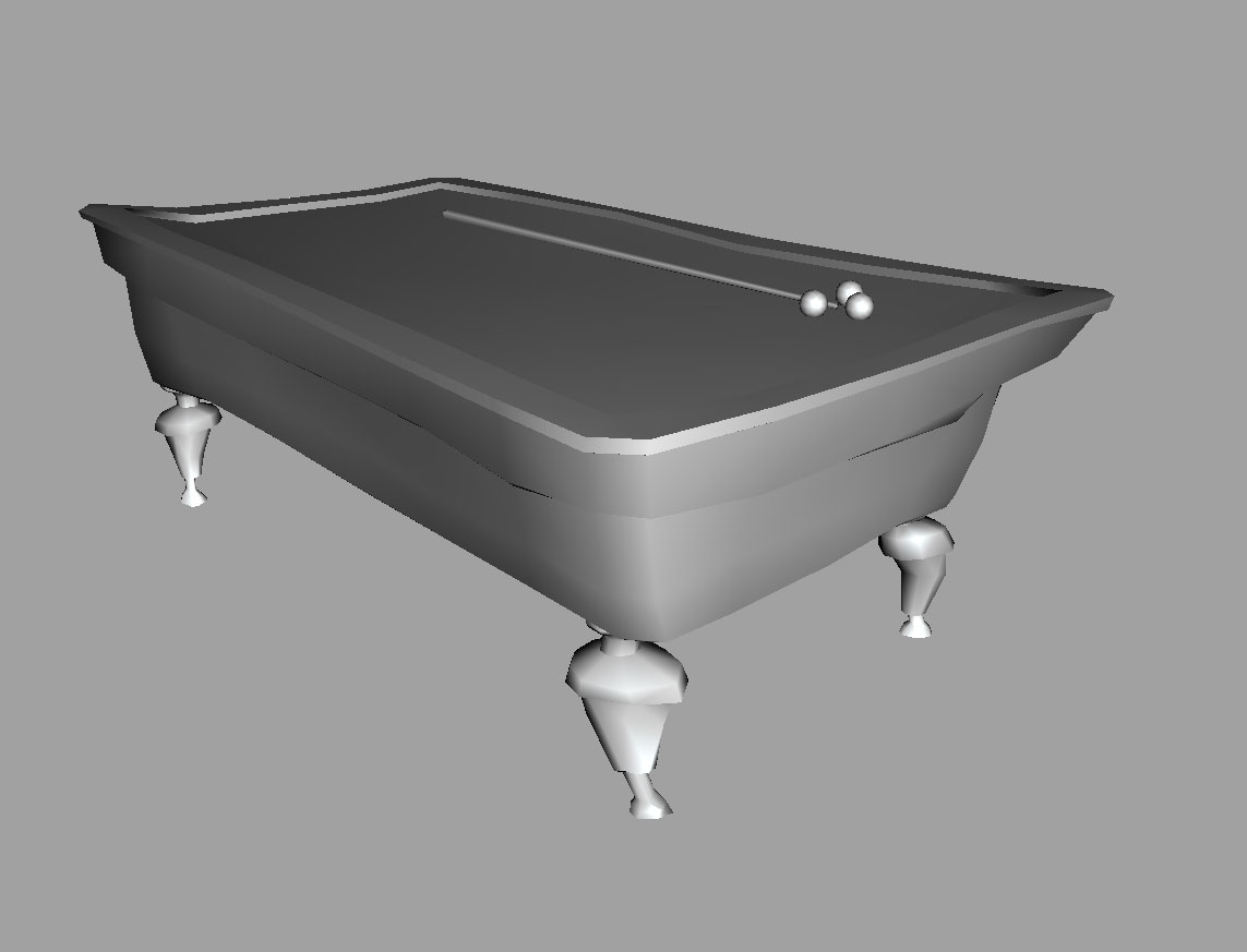 Warped billiard table Once I had the straight version I could then warp it in Mudbox using the Move tool to drag selections of vertices in different ways to give it some flow and mood similar to the way it appears in the painting. The falloff selection tools in Maya were also useful in quickly warping an object. The other consideration is polycount — I had to maintain a tight poly budget throughout, allocating more or less depending on the objects importance in terms of proximity to the viewer or complexity of the object. The character portraits were given many more polygons than props because they had to include more details that the viewer would pick out. I find myself scrutinizing characters more than other models, especially when they are animated. In order to give a character lifelike movements, especially if you use blendshapes or many facial animations, you need the polygon detail to support the complex and often subtle movements. I also think people generally relate to characters more than they do other objects and so will spend more time looking at them. 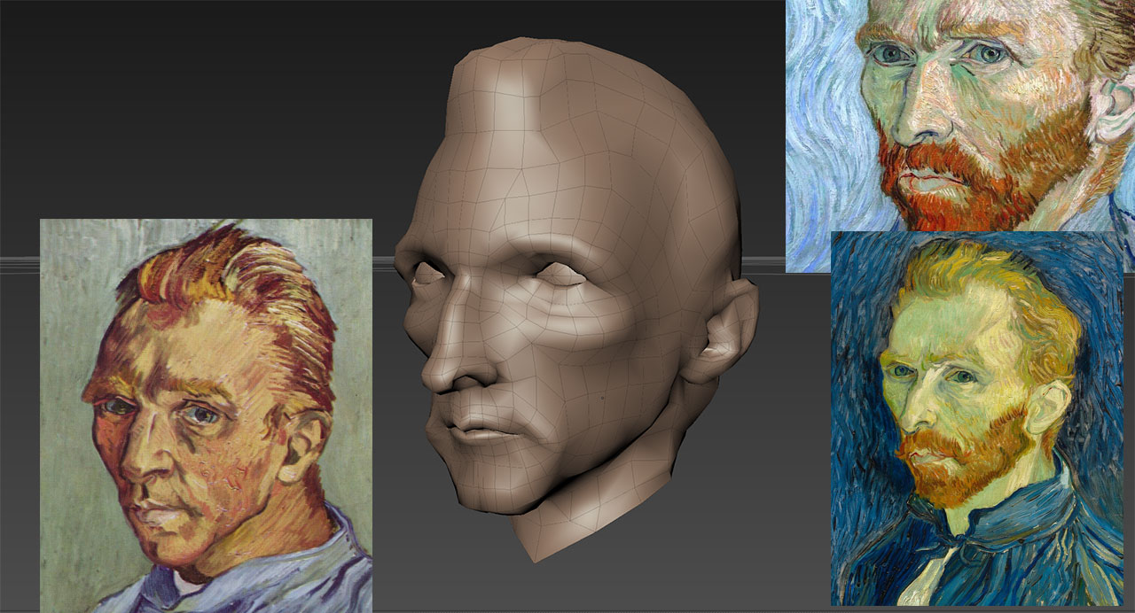 Plenty of references to work with Character models were approached in a slightly different way than objects in that I would make a very rough base mesh using orthographic sketches and then get it into a sculpting program as quickly as possible to really start working out the forms. I use zBrush for sculpting because I generally prefer the interface over Mudbox — it is more intuitive with a Wacom pen and I tend to work faster in it as a result. With the portraits I would generally find as many references as possible, fortunately for this project Van Gogh had painted many self portraits and although I focused on 1-2 I had several different angles to refer to should I need more information for the sculpt. 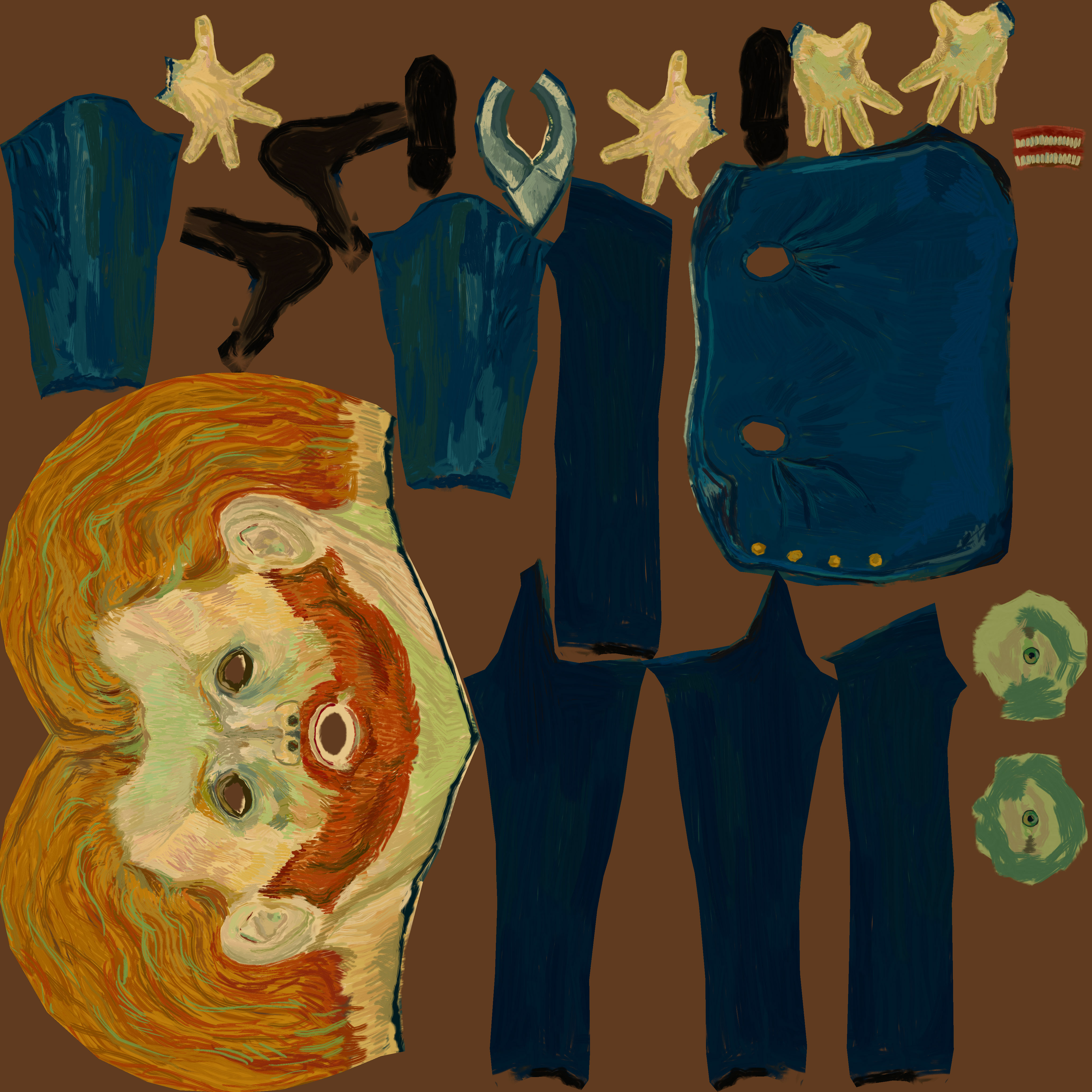 Guess who this texture belongs to Texturing was done entirely in Mudbox because it allows you to paint directly to a bitmap (compared to zBrush which requires you to increase your vertex detail to extreme levels which can be useful for high polygon sculpting but not for low-poly game assets). I tried to recreate the look of a brush used with oil paints using various alphas as my brush setting. For the most part I just painted in a very traditional way without using any fancy tricks to achieve the look. This meant I had a lot of surfaces to paint. The main difference between painting the objects and painting a canvas is the sheer amount of surface that needs to be covered. Instead of only painting the side the appears to the camera (or eye ball) you have to paint the back of it and the top of it, and every angle that could be seen by someone walking around it. Walls took the longest and were the most boring because I had to maintain that layered brush stroke look while just using the same 5 shades of a color to span a very large surface area. Below is the texture being painted for Portrait of Madame Ginoux who appears in the DK2 version: After all the textures were done I had to rig and animate the characters. Initially I had decided I wanted to use 2 Kinects in a motion capture setup but after several tests I realized I would not get the fidelity of animation I needed for this — generally the animation came out too jittery and wobbly and the automated filters would just remove all the life from it so it wasn’t even ideal for a base layer of animation. Instead I fell back on good old fashion hand key framing techniques. Animation is a very time consuming activity and I had to reduce the scope a bit and cutout many of the animations I wanted to include given the time constraints I had. 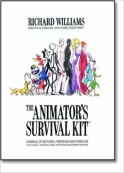 “The Animator’s Survival Kit” By Richard Williams I highly recommend the book, “The Animator’s Survival Kit” by Richard Williams. This book has loads of useful advice about all forms of animation and I’ve consulted it many times over the years, from simple (but actually complex) walk cycles, to the important of timing in creating believable animation. Timing is something that should not be overlooked because it can be the difference between everything moving at the same rate and looking artificial or everything having unique variation to the timing to give a much more lifelike feel to the movement. A great technique that has been used throughout the history of animation (as far back as Snow White and the Seven Dwarves) is the use of reference footage shot and then used to time out actions. It not only helps with timing but also with planning movements and noticing minute details that may be overlooked. 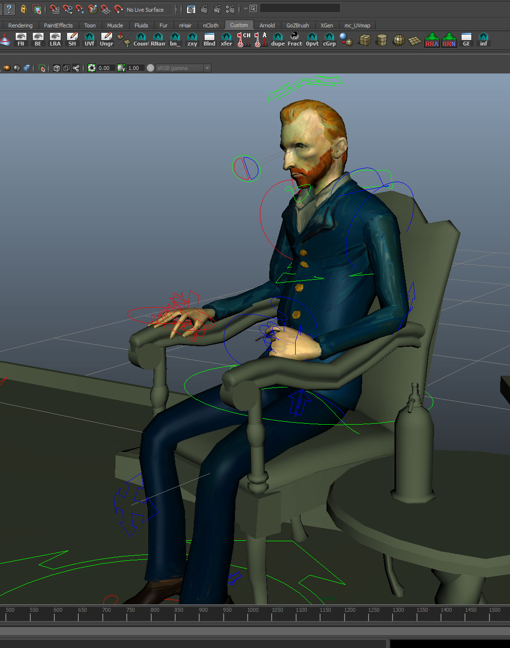 Van Gogh was rigged using RapidRig Of course animation would not be possible without a good enough rig. I say good enough because rigs are one of those tools that can always be improved upon and will almost always give you some level of frustration so it’s more a matter of finding the solution that will work for your given situation. In this case I used an automated rigging solution called RapidRig. This is the first time I had used an auto rig, in the past I had never found one that was good enough and always had to spend many an hour building them manually. I cannot recommend RapidRig highly enough; it’s $40 bucks and will save you hundreds of hours if you rig a lot. You can setup a rig customized to your character (in this case a human although I know they offer non human rigging solutions as well) and then it’s really just a matter of painting skin weights. This is still tedious but I was happy to do this after saving so much time not rigging. (Weight painting tip: use joint influence locks all the time to eliminate the inevitable spill of weights into other unwanted joints. It requires a lot of turning locks on and off but saves time in the long run). Another great tool for weight painting and transferring weights from one rig to another, which I had to do when I started with custom rigs and then switched to RapidRig — abWeightLifter — a free plugin for Maya that allows simple lossless weight copying from one joint to another. That’s it for Part 1 — check back in a few days for a wrap up on the project including getting everything working in Unity, scripting the controls, and optimizing for Gear VR. (Here is a link to part 2). |
||
© 2026 Borrowed Light Studios LLC |